Volvo Logo vs Nissan Logo

Volvo Logo vs Nissan Logo
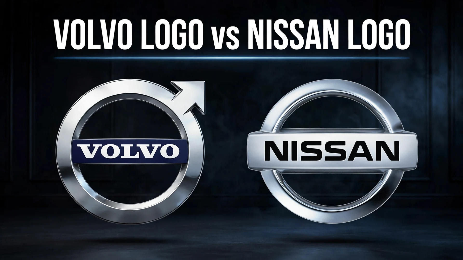
The Volvo logo is the ancient alchemical symbol for iron — a circle with an arrow pointing up and to the right — first used on the Volvo OV 4 in 1927 to evoke Swedish steel and strength. The Nissan logo is a circle with a horizontal bar carrying the company name, derived from the 1930s badge combining a red rising-sun circle with a blue rectangle, inspired by founder Yoshisuke Aikawa’s belief that strong conviction “penetrates even the sun.” Both brands independently flattened their logos to minimalist 2D designs within a year of each other (Nissan in 2020, Volvo in 2021), which is why the modern badges look oddly similar. The resemblance is a coincidence of industry-wide design trends, not copying.
- Volvo’s “iron mark” dates to 1927 and symbolizes iron/steel — it is also the astrological sign for Mars, which causes frequent confusion with the male gender symbol.
- Nissan’s circle-and-bar badge traces to the 1930s Datsun-era logo: a red circle (the rising sun, a nod to Japan’s flag) crossed by a blue bar.
- Nissan went flat and monochrome in July 2020; Volvo revealed its flat 2D iron mark in September 2021, rolling out on cars from 2023.
- The two logos converged because the whole auto industry moved to flat, digital-friendly badges at the same time — BMW, Volkswagen, and MINI did the same.
- Neither brand copied the other; the underlying symbols are nearly a century old and completely unrelated.
Logo at a Glance
Volvo — the iron mark. A circle with an arrow at roughly the 2 o’clock position, with VOLVO lettering across the center. The symbol is the pre-modern chemical sign for iron, chosen in 1927 to associate the brand with the Swedish steel industry. The current flat version, designed with Stockholm Design Lab, removed the navy center band and 3D chrome for a pure black-and-white mark.
Nissan — the circle and bar. A thin circular outline split by the NISSAN wordmark, which acts as a horizontal bar across the circle. It descends from the 1930s badge — a red circle (rising sun) behind a blue rectangle — and embodies founder Yoshisuke Aikawa’s mantra that strong belief “penetrates even the sun.” The 2020 redesign flattened it for the digital and EV era, debuting on the Ariya electric crossover.
Why they look alike now. Both marks are now thin-line, monochrome, geometric badges: a circle, a wordmark, minimal detail. That is the house style of 2020s automotive branding — optimized for screens, illuminated grilles, and app icons. The similarity lives entirely in the style of the drawing; the symbols themselves (iron arrow vs. sun circle) share nothing.
The Volvo Logo: A Century of the Iron Mark
Volvo’s founders chose their emblem with unusual deliberateness. When the first Volvo — the OV 4, nicknamed “Jakob” — rolled out in April 1927, it wore a circle-and-arrow badge mounted on the radiator via the now-famous diagonal slash across the grille. The symbol was the old alchemical sign for iron: a circle with an arrow pointing to the upper right. The founders, who had backgrounds in the Swedish steel industry, wanted the mark to say “Swedish steel” and “strength” at a glance. The fact that the same glyph is also the astrological symbol for Mars — and, by extension, the conventional male gender symbol — has caused a century of confusion, but the iron interpretation is the documented one.
The iron mark evolved through recognizable eras. A 1930 redesign introduced a stark black-and-white wordmark; around 1940 the full circular emblem with its diagonal bisecting line became the structural ancestor of the modern badge. The 1959–1970 era gave the mark its teal-turquoise identity with the VOLVO banner in white capitals — the badge most associated with Volvo’s rise as a global safety pioneer. In 2014, Stockholm Design Lab refined the iron mark (a subtle tweak that aligned the arrow with the diagonal slash), and then in September 2021 Volvo revealed the current flat, two-dimensional version: no more chrome, no more navy center band, just the circle, arrow, and wide lettering in black and white. It appeared first on the brand’s digital channels and social platforms, then on production cars starting with the 2023 model year — the EX90 and the XC40/C40 Recharge were among the first to wear it.
The Nissan Logo: From Rising Sun to Flat Badge
Nissan’s badge story starts with Datsun. When Nissan took control of DAT Motors in the early 1930s, it inherited a logo built on a red circle crossed by a blue rectangle — the circle representing the rising sun and, by extension, Japan’s flag. Founder Yoshisuke Aikawa’s guiding mantra, that “if you have a strong belief, it penetrates even the sun,” was baked into the design: the belief (the name bar) literally pierces the sun (the circle).
The logo kept its circle-and-bar DNA through every era while the rendering changed with fashion. The 2001 redesign gave it a three-dimensional chrome treatment — described at the time as representing “sophistication, modernism, creativity and perfection” — and the 2012 version warmed the metallics. Then, in July 2020, Nissan unveiled the flat redesign: the chrome became thin monochrome lines, the wordmark slimmed down and stretched slightly, and the bar-and-circle was reduced to its purest geometry. It debuted on the Ariya electric crossover, whose illuminated badge uses 20 LEDs — a deliberate nod to the 20 years since the previous redesign. Nissan created four variants (2D white, 2D black, 3D white with shadow, 2D white with shadow) for different media, and the design team noted the shift from a “hard-edged, industrial feel to a refined, familiar and digital-friendly look.”
Why They Converged: The Flat-Logo Era
Automotive flat-logo redesigns, 2019–2021
Context matters: Nissan’s 2020 redesign and Volvo’s 2021 reveal were part of an industry-wide movement. Volkswagen went flat in September 2019, BMW in March 2020, and MINI and others followed. The drivers were practical — badges now had to work as app icons, website favicons, and illuminated elements on electric grilles — and aesthetic, as the industry embraced minimalist “digital-first” identity. As Nissan’s own design team put it, the goal was a mark that could “live in multiple worlds.” When every brand draws its badge with the same thin monochrome lines, century-old symbols start to rhyme visually even when they share no ancestry.
Head-to-Head Comparison
| Aspect | Volvo | Nissan |
|---|---|---|
| Core symbol | Circle with arrow (iron mark) | Circle with horizontal name bar |
| Meaning | Alchemical symbol for iron; Swedish steel, strength | Rising sun (Japan) pierced by belief; founder’s mantra |
| First appeared | 1927, on the Volvo OV 4 | 1930s, Datsun-era red circle + blue bar |
| Flat 2D redesign | September 2021 (on cars from 2023) | July 2020 (debuted on Ariya) |
| Design agency (latest) | Stockholm Design Lab | In-house (Tsuyoshi Matsuo-led team) |
| Signature detail | Arrow aligns with the diagonal grille slash | 20 LEDs on the Ariya badge = 20 years between redesigns |
| Common confusion | Mistaken for the male gender / Mars symbol | None widely reported |
Did One Copy the Other?
No — and the timeline makes that clear. Volvo’s symbol is from 1927 and Nissan’s from the 1930s; both predate the other’s flat redesign by the better part of a century. What happened in 2020–2021 was two independent responses to the same brief: make the badge work on a screen. Design writers at the time explicitly noted the resemblance — several pointed out that the new Volvo mark “reminds” them of Nissan’s — but treated it as a symptom of the minimalist trend, not plagiarism. If anything, the convergence is a useful reminder that when every brand optimizes for the same digital constraints, distinctiveness gets harder to maintain.
The Verdict
On heritage, Volvo’s iron mark wins for sheer continuity of meaning: nearly 100 years of the same symbol, chosen for a specific reason, still legible today. On modern execution, Nissan’s 2020 redesign was the bolder break — a genuine reinvention of a chrome-era badge for the EV age, complete with the illuminated Ariya treatment. But the real winner of the comparison is the insight it offers: two companies, two continents, two unrelated symbols, arriving at nearly the same drawing because the medium — the screen — demanded it. The logos did not copy each other. The era copied itself onto both of them.
FAQ
What does the Volvo logo mean?
It is the ancient alchemical symbol for iron — a circle with an arrow pointing to the upper right — chosen in 1927 to associate Volvo with the Swedish steel industry and convey strength. It is not the male gender symbol, though the glyphs are identical; the iron interpretation is the documented one.
What does the Nissan logo mean?
The circle represents the rising sun (a nod to Japan’s flag) and the horizontal bar carries the company name. It reflects founder Yoshisuke Aikawa’s mantra that “if you have a strong belief, it penetrates even the sun” — the belief bar pierces the sun circle.
When did Volvo and Nissan change to flat logos?
Nissan revealed its flat, monochrome logo in July 2020, debuting on the Ariya electric crossover. Volvo revealed its flat 2D iron mark in September 2021, with the new badge appearing on production cars from the 2023 model year onward.
Did Volvo copy Nissan’s logo?
No. Volvo’s iron mark dates to 1927 and Nissan’s circle-and-bar to the 1930s — both are nearly a century old. The modern resemblance comes from both brands independently adopting the thin-line, monochrome, flat style that swept the auto industry around 2019–2021.
Why do car logos all look the same now?
Badges now have to function as app icons, website elements, and illuminated grille features on EVs, which pushed every brand toward simple, flat, digital-friendly geometry. Volkswagen, BMW, MINI, Nissan, and Volvo all flattened their logos within about two years of each other for these practical reasons.
What is the diagonal line on the Volvo grille?
The diagonal slash across Volvo’s grille dates to 1927 — it was originally just the mounting bracket for the iron-mark badge on the OV 4. It became a signature design element, and the 2014 redesign by Stockholm Design Lab specifically aligned the logo’s arrow with the slash.
Sources
- Team-BHP — Volvo reveals its new iron mark logo (September 2021)
- Chasing Cars — Volvo makes subtle changes to its logo for 2023 and beyond
- Design Week — Volvo updates its identity (Stockholm Design Lab)
- CarBuzz — 7 facts you should know about Volvo
- Dezeen — Nissan latest automotive brand to roll out flat logo (July 2020)
- Design Week — Nissan reveals new logo for the “digital world”
- BeForward — History of Nissan cars and the meaning of the logo